Coco Software studio / INDEPENDENT DIGITAL STUDIO
Community sport · Digital experience

More than
a noticeboard.An invitation to play.

Three simple questions shape the new experience: Can I play here? How can I improve? What should I know before my first visit?

Pymble Table Tennis Club   /   Client story / Community & sport
01

A clearer sporting identity

02

Easier paths to participate

03

A more usable mobile experience

01 / THE OPPORTUNITY

The club had more to offer
than its website showed.

Pymble Table Tennis Club operates at Ku-ring-gai Town Hall and welcomes players of different ages and abilities. Coaching, junior programmes, holiday camps and community competition were all there, but a large image and news-led website asked newcomers to figure out where to begin.“The goal was not merely “a nicer website”. It was helping visitors understand how to join in.”

01
Can I come and play?

Bring casual play and planning a first visit into view.

02
Who can help me improve?

Make coaching and junior programmes easier to discover.

03
What do I need to know?

Organise fees, sessions, location and contact details clearly.

02 / BEFORE & AFTER

Same club.
A clearer first impression.

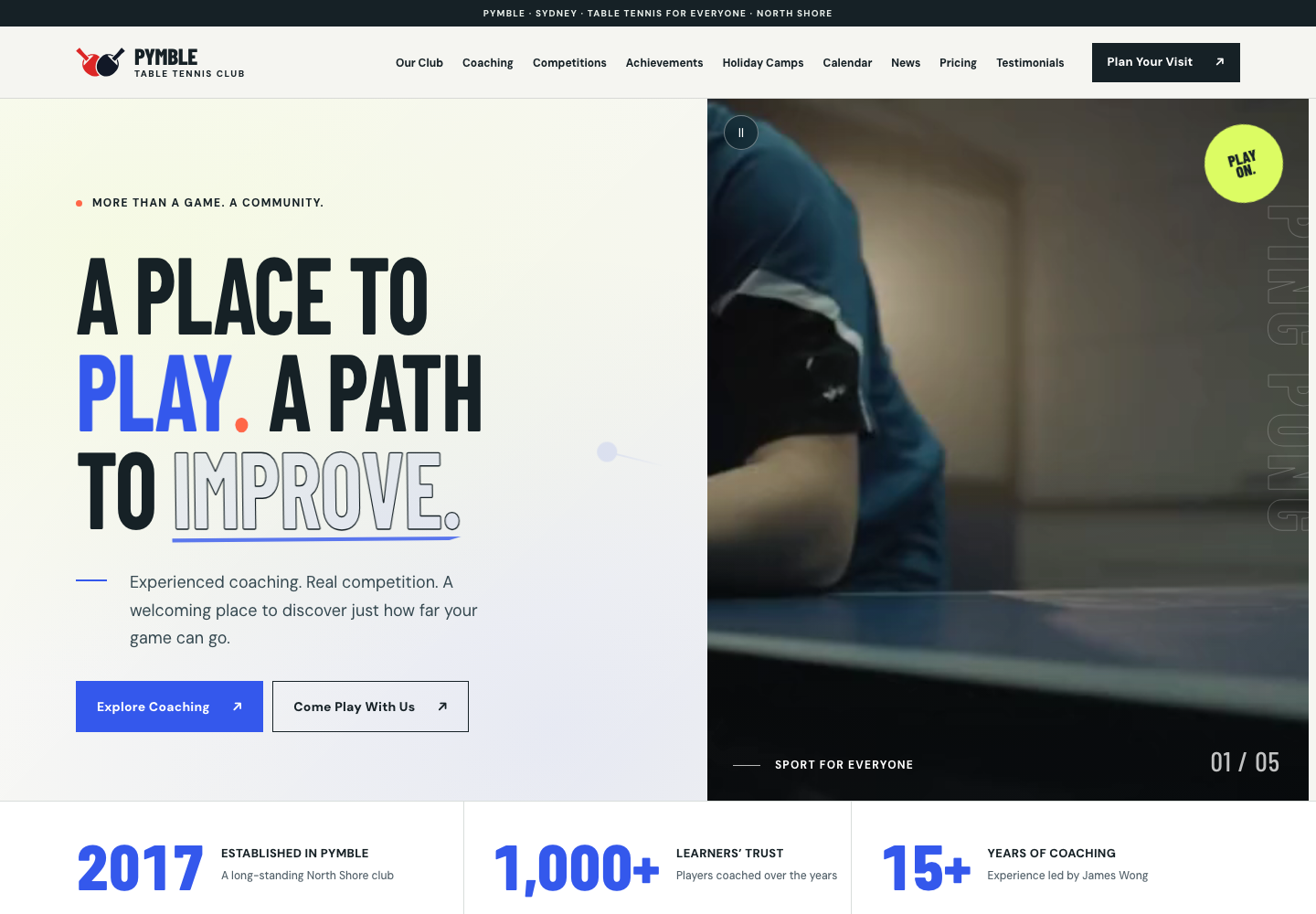
We kept the club’s activities and information, then changed the sequence: rather than news first, help each visitor choose the right way to participate. Switch the views to explore the homepage, fees and mobile design.
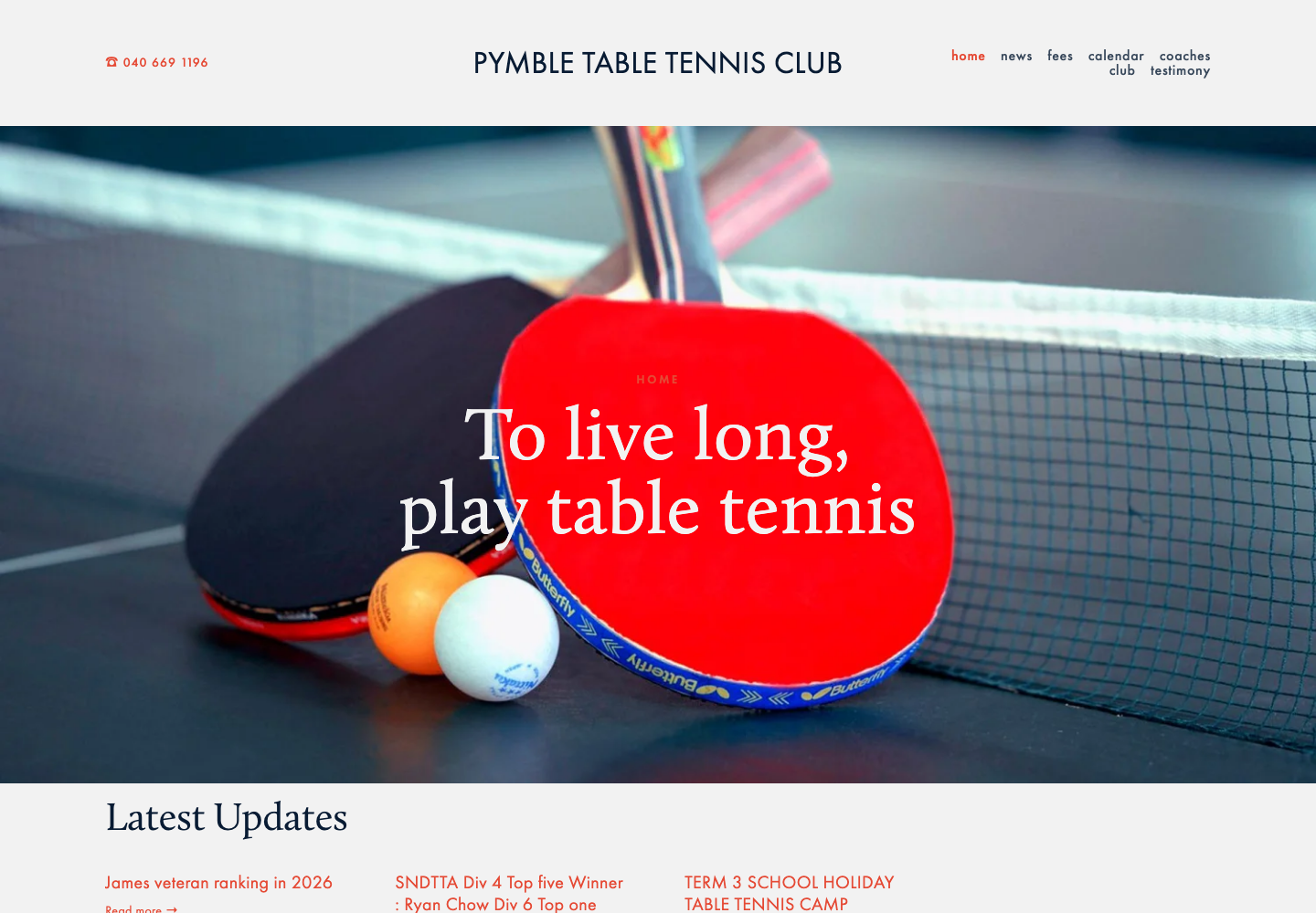
Before PTTC / ORIGINAL
Pymble TTC homepage before redesign

The answers exist. Visitors have to piece them together.

  • A large image dominates the first screen
  • News and updates appear early
  • Playing and coaching are further down
After PTTC / REDESIGN
Pymble TTC homepage after redesign

Answer the question first; make the next step obvious.

  • Recognisable club identity and sporting message
  • Separate first-screen links for play and coaching
  • Camps, fees and visits have clearer navigation
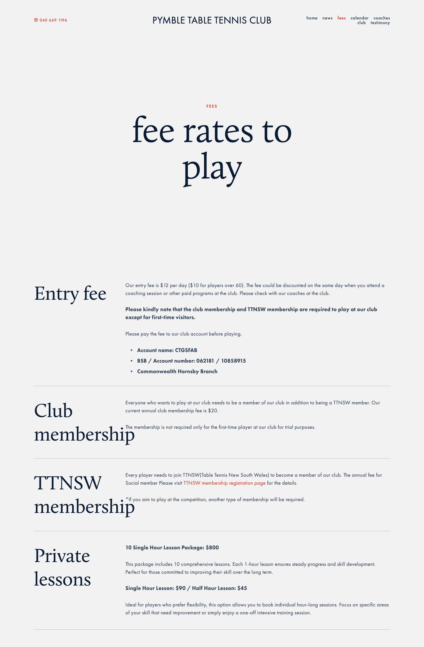
Before PTTC / ORIGINAL
Pymble TTC fees page before redesign

The answers exist. Visitors have to piece them together.

  • Fees and membership details sit inside paragraphs
  • Lesson lengths are harder to compare
  • A visitor may need to ask for clarification
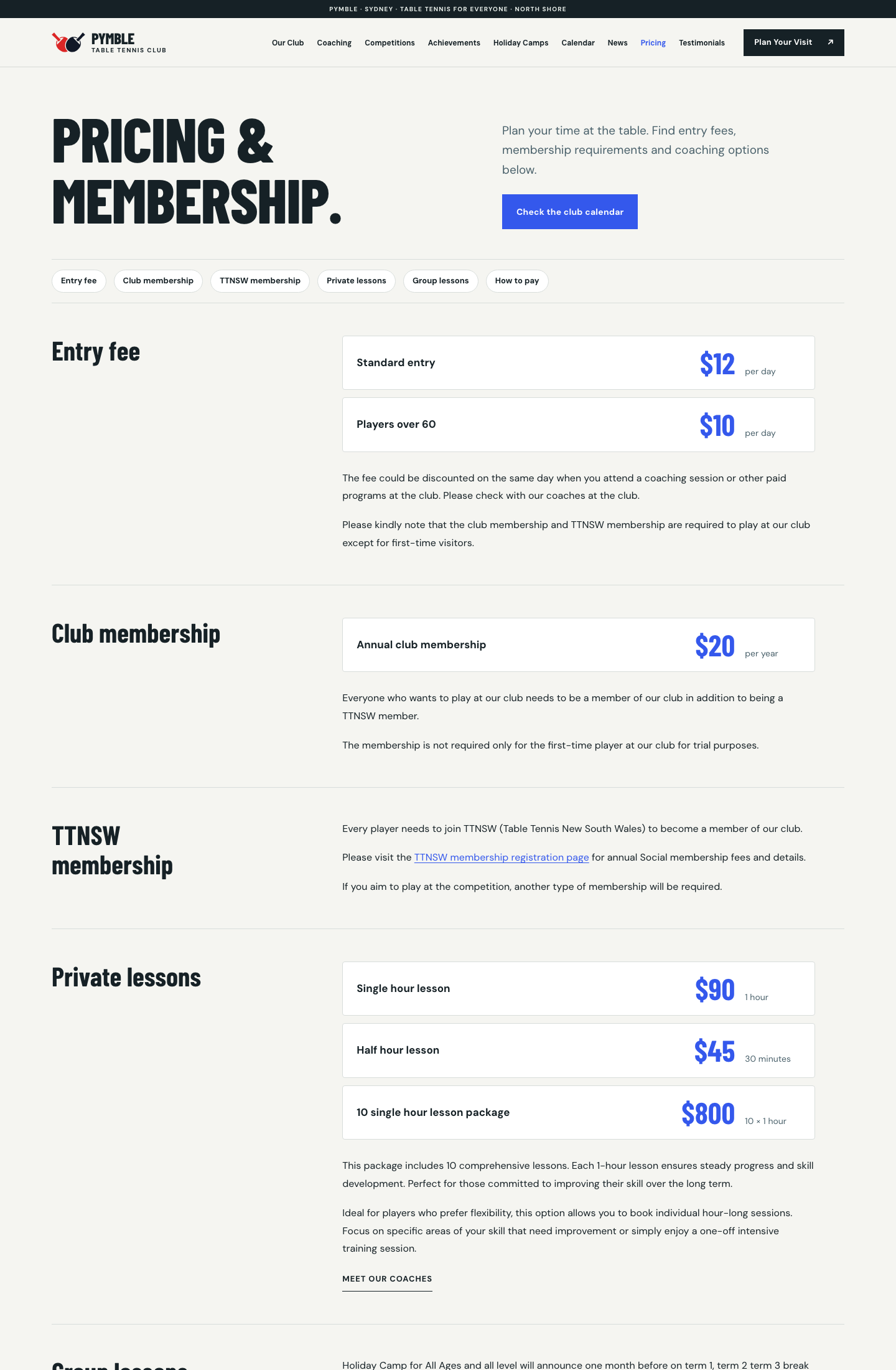
After PTTC / REDESIGN
Pymble TTC fees page after redesign

Answer the question first; make the next step obvious.

  • Entry, membership and coaching are separated
  • Amounts and billing units are shown together
  • Quick links help visitors choose with confidence
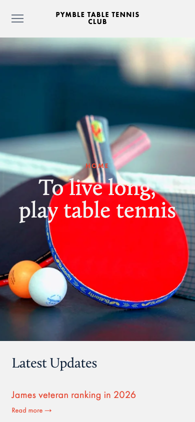
Before PTTC / ORIGINAL
Pymble TTC mobile homepage before redesign

The answers exist. Visitors have to piece them together.

  • Desktop-style hero dominates the mobile fold
  • Getting involved is hidden below the menu
  • Useful actions appear later
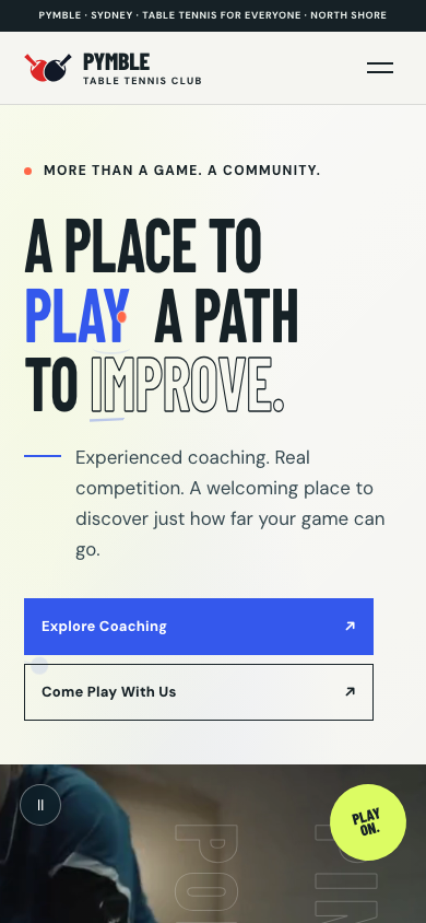
After PTTC / REDESIGN
Pymble TTC mobile homepage after redesign

Answer the question first; make the next step obvious.

  • Headline and actions come before video
  • Choose play or coaching immediately
  • Fees and directions are closer to hand
03 / EXPERIENCE DESIGN

Energy on screen.
Clarity at every step.

Every design decision makes participation easier; none exists only to decorate.

01

An immediate invitation

Give newcomers two choices from the first screen: casual play or coaching.

02

Fees made understandable

Keep the published amounts; organise entry, membership and lessons so visitors can compare.

03

Relevant to younger players

Footage, junior programmes and competition stories show the atmosphere; TikTok and Xiaohongshu connect back to the website.

04

Accessible interaction

Clear controls and headings help different visitors navigate, with more control over moving imagery.

04 / EVIDENCE & MEASUREMENT

More visual richness.
Less loading overhead.

Both homepages were cold-loaded three times each under matched simulated slower mobile conditions. Figures are medians and include third-party scripts. They are not real-user field data.

~89% less JavaScript transferred (simulated test)
LCP · Largest Contentful Paint
Main content appeared sooner
9.59 s
2.06 s
FCP · First Contentful Paint
The page began rendering sooner
6.13 s
1.16 s
JavaScript transfer
Around 89% less data
1.63 MB
0.18 MB
CLS · Layout shift
Less movement during load
0.040
0.003

Medians of 3 matched mobile tests · 11 Oct 2026 · simulated slower connection. These metrics are not field data and must not be used to infer conversion uplift.

05 / INCLUSIVE BY DESIGN

An easier experience
for more people.

In the same automated homepage accessibility checks, the old version showed two issue types and the redesigned version showed no detected violations. Automated testing is not a complete WCAG audit; manual review is still necessary.

AUDIT NOTE

A matched automated check

Same tool and scope, homepage only. “0 violations” is not a claim of complete accessibility compliance.
2 issue types Previous automated check
0 violations Redesigned automated check
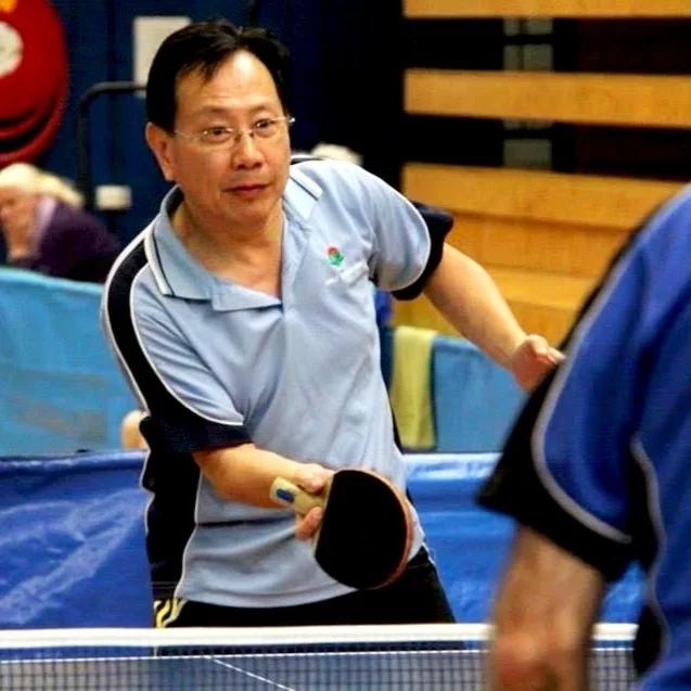
James Wong, Pymble TTC owner and head coach

James Wong

Owner & Head Coach · Pymble Table Tennis Club

06 / THE CLUB’S PERSPECTIVE

Help a new generation
find their community.

“The new website Kai designed brings us closer to that younger audience and perfectly reflects what we wanted to achieve.”

Club owner and head coach James Wong emphasised in the original project material that the game welcomes different ages, and the website should help younger players and families discover the community.

THE LONGER VIEW

The deliverable was not simply a new webpage.
It was a clearer invitation to participate.

A community organisation does not need an elaborate commerce site. It needs to make real activities appealing, answer first-visit questions, and work on phones and assistive technology. That is where the design adds value.

Coco / BUSINESS-FIRST DESIGN

Your website should make the next step easy.

If people still have to hunt for what you offer or guess how to start, a focused website review may be the best first step.

Discuss a website redesign ↗